A toilet sign on a door may seem like a small detail, but in real spaces it has a direct effect on how people move, how quickly they find the restroom, and how professional the whole environment feels. In restaurants, offices, hotels, retail stores, and public buildings, visitors do not want to stop and ask where the restroom is. They expect the sign on the door to be clear, fast to read, and easy to understand at a glance.
So when people ask how to toilet sign for door dash, the practical question is usually this: how should a toilet sign be designed and used on a door so people can recognize it quickly and the space still looks clean and modern? The answer comes down to clarity, material, placement, and consistency.
In commercial interiors, people often make judgments in seconds. If a restroom is hard to find, visitors may feel the building is not organized well. If the sign is unclear, people may hesitate at the door or even enter the wrong space. These are small moments, but they affect comfort and overall experience.
A toilet door sign solves that problem in a simple way. It gives instant direction without needing words from staff. In busy spaces, that saves time and avoids repeated questions. In quieter spaces, it protects privacy and makes movement feel natural. This is especially important in places where many people come and go throughout the day, such as cafés, office corridors, waiting areas, and hotel public zones.
Good signage also helps unify the space. When restroom doors are marked with the same visual logic as other wayfinding elements, the environment feels more deliberate. That kind of consistency matters in modern interiors, where buyers often want every visible detail to support a clean and coordinated appearance.
A toilet door sign should be understood almost immediately. That means the symbol or wording must be simple, visible, and familiar. Most people do not stop in front of a restroom door to study the design. They want to understand it in one quick glance while walking.
The sign should also feel durable. In everyday use, restroom signs are exposed to hand contact, cleaning, humidity in some interiors, and constant public visibility. If the material scratches easily, fades too quickly, or looks weak after installation, the space starts to feel less maintained.
At the same time, the sign should fit the design of the building. Modern interiors usually work better with restrained shapes, balanced proportions, and finishes that match door handles, hinges, locks, or other accessories. A well-designed sign does not need to look loud to be clear. It only needs to be legible, well placed, and visually balanced.
In older interiors, toilet signs were often plastic, brightly colored, or overly decorative. They did the job, but they often looked separate from the rest of the Door hardware. Today, many projects prefer a more architectural look. The sign is expected to function clearly while still matching the finish language of the space.
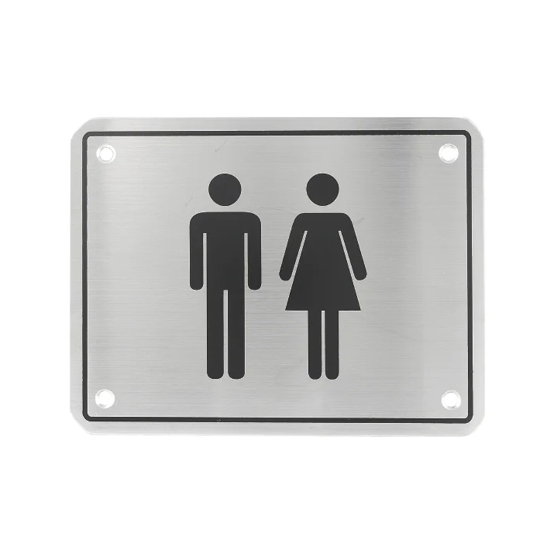
That is why metal toilet door signs have become more common in higher-quality commercial and hospitality interiors. A stainless steel sign usually feels more solid, more professional, and more in line with modern door accessories. It can also coordinate better with satin, brushed, polished, black, or brass-tone hardware finishes used throughout the project.
A simple graphic in the center often works best. It communicates quickly and reduces language barriers. In spaces with international visitors or mixed user groups, a recognizable symbol is usually more practical than relying on text alone. The cleaner the visual message, the more effective the sign becomes.
Material has a direct effect on both appearance and service life. A low-grade sign may look acceptable when first installed, but over time it can discolor, bend, scratch, or lose its clean edge. Because restroom signage is a permanent visible element, buyers usually benefit from choosing a stronger material from the beginning.
Stainless steel is often preferred because it offers a solid structure and a more refined surface. It suits modern commercial spaces well and can remain visually stable after daily use. Satin finishes are especially practical because they look clean without drawing too much attention, and they match many common hardware styles.
A well-made metal sign also supports the feeling of quality in the surrounding interior. When visitors touch the door handle, see the sign, and move through the space, these details work together. Even though the sign is small, its material still contributes to the overall impression.
The best approach is to treat the sign as part of the door accessory system. That means considering how it looks next to the handle, the lock, the door surface, and nearby architectural details. A square or rectangular sign with a neat brushed finish often works well because it is simple, readable, and easy to integrate into contemporary interiors.
Before choosing a toilet door sign, it helps to think about how the space will actually be used. If the building receives many visitors, clarity should come first. If the project is design-led, finish consistency becomes more important. If the sign will be mounted in a high-contact public area, material durability matters more than initial cost.
It is also useful to check whether the sign is suitable for door fitting, wall fitting, or both. Some projects prefer the sign directly on the door because it gives the clearest visual cue. Others may use wall placement when door surfaces change or where layout requires a different viewing angle. A flexible sign system is often easier to apply across different project types.
The fixing method matters too. Secure screw fixing often gives a more dependable result in long-term use. It helps the sign stay aligned and stable, especially in busy environments where appearance and reliability both matter.
A toilet door sign should do one job very well: help people identify the restroom quickly and comfortably. But the best signs do more than that. They also support privacy, improve movement through the space, and contribute to a cleaner, more professional interior. In many modern projects, a stainless steel toilet sign with a simple, easy-to-read symbol is one of the most effective choices because it combines clarity, durability, and visual balance.
When selecting a toilet sign for a door, it is worth paying attention to material, symbol design, finish, mounting method, and placement. These details may seem small, but together they shape how the space feels in daily use.
If you are comparing toilet door sign options for a commercial project, hospitality interior, office, or public facility, feel free to contact us. We can help you review finish choices, installation needs, and suitable sign styles so your project has a clearer and more coordinated solution.
Previous: How To Pick A Door Handle Lock?